In digital design, "Center Align" is a safe button. It ensures perfect symmetry on a flat screen. But in the physical world of bookbinding, geometric centering is a trap.
When you apply a perfectly centered logo to a hardcover notebook spread or a Tip-In page, you ignore the mechanical reality of the "Binding Gutter." The result? Your artwork looks off-center, cramped, or worse—partially swallowed by the spine.
In the customization process, mastering the "Visual Center" vs. the "Geometric Center" is what separates professional print design from amateur mistakes.
The Physics of the Curve
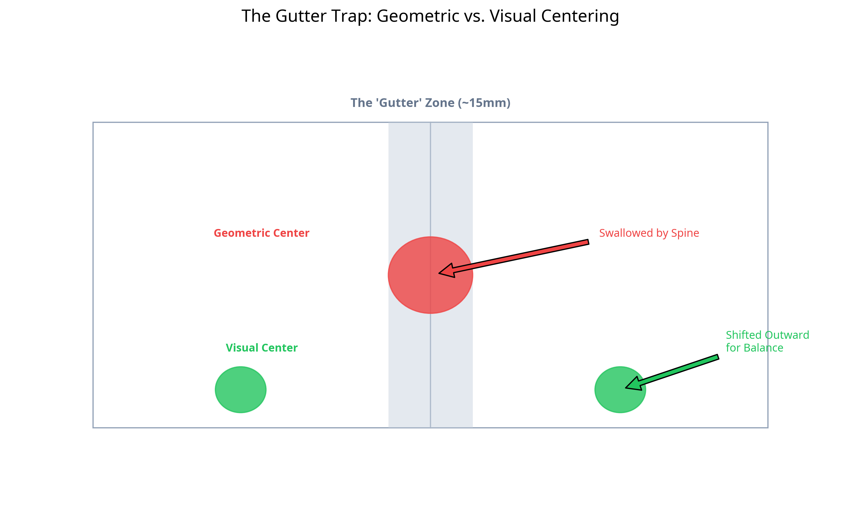
A hardcover notebook is not a flat plane. It is a hinged object. When opened, the pages curve down into the spine. This curvature creates a "blind spot" known as the Gutter.
Depending on the binding method (Smyth Sewn vs. Perfect Bound), this gutter can consume anywhere from 10mm to 15mm of visible space on the inner edge of the page.
If you place a logo at the exact mathematical center of the page width (e.g., 105mm on an A5 page), it will visually appear to be "falling" into the spine because the eye perceives the visible page width, not the flat sheet width.
The "Optical Center" Rule
To fix this, we use a principle called Optical Centering. This involves two deliberate shifts:
- Horizontal Shift: Move the artwork away from the spine by 3-5mm. This compensates for the gutter loss and makes the design appear centered on the visible flat area.
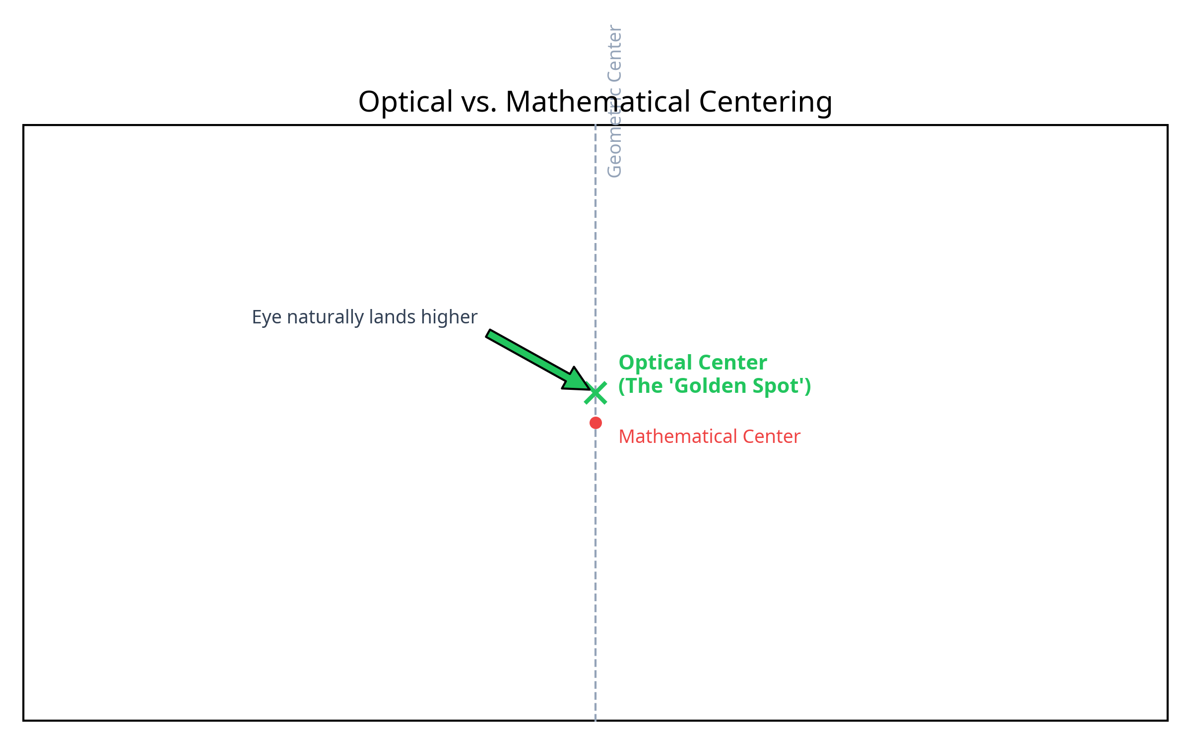
- Vertical Shift: Move the artwork slightly above the mathematical center. The human eye naturally perceives the "visual center" of a rectangle to be slightly higher than the geometric center.
Practical Application: The Tip-In Page
This error is most common in Tip-In Pages (advertising inserts). Designers often create these as standalone PDFs, forgetting they will be glued into a book.
In practice, this is often where customization decisions start to be misjudged. A designer sends a "Spread" (two facing pages) with an image spanning across the middle. They assume the book opens flat.
It doesn't. The central 20mm of that image will be distorted or hidden in the valley of the book. Faces, text, or key logos should never be placed across the gutter.
The Consultant's Verdict
Stop trusting the "Align Center" tool in Adobe Illustrator. It doesn't know you are designing for a 3D object.
Always ask your factory for the "Visible Area Template" before finalizing artwork. And if in doubt, shift your logo 5mm away from the spine. Your eye will thank you.