The most common disappointment in corporate gifting is opening a box of "Premium Black Notebooks" only to find the company logo looks... grey. Not white. Not crisp. Just a milky, translucent grey.
This isn't a printer error. It's a physics problem. It happens when procurement teams choose Digital UV Printing for dark materials to save on setup costs, not realizing that digital white ink is fundamentally different from screen printing ink.
In the customization process, understanding the "Opacity Gap" is the difference between a brand asset and a cheap giveaway.
The Physics of Translucency
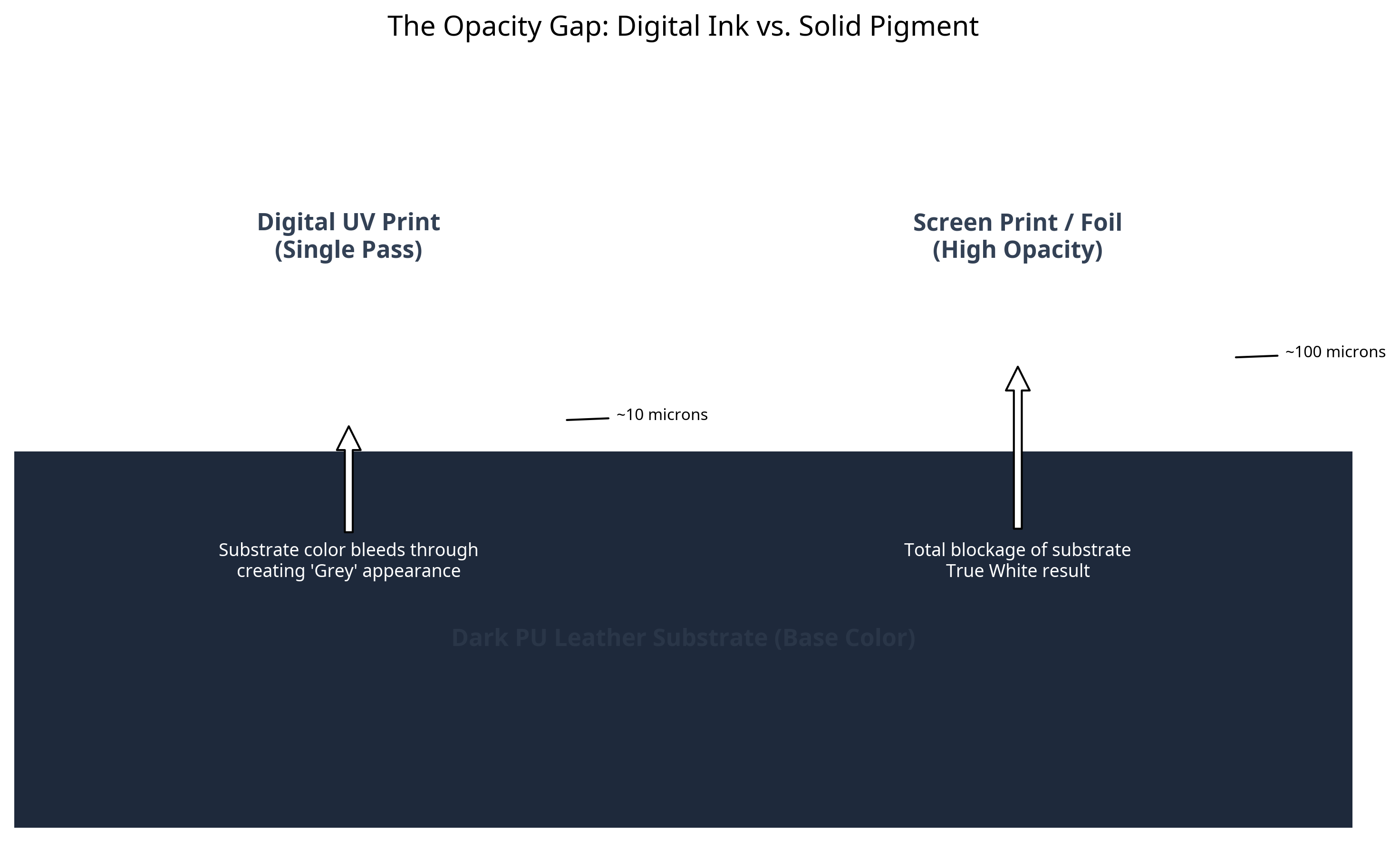
To understand why this happens, we have to look at the ink itself. Digital UV ink is designed to be sprayed through microscopic nozzles. To flow through these nozzles, the ink must have a low viscosity and a fine pigment particle size.
Screen printing ink, by contrast, is a thick paste. It is pushed through a mesh screen using a squeegee. It doesn't need to flow; it needs to sit.
When you print digital white ink on a black notebook cover, you are essentially laying down a thin, semi-transparent film. The dark color of the leather absorbs light through this thin layer, muddying the white reflection. We call this "Substrate Interference."
The "Double Pass" Myth
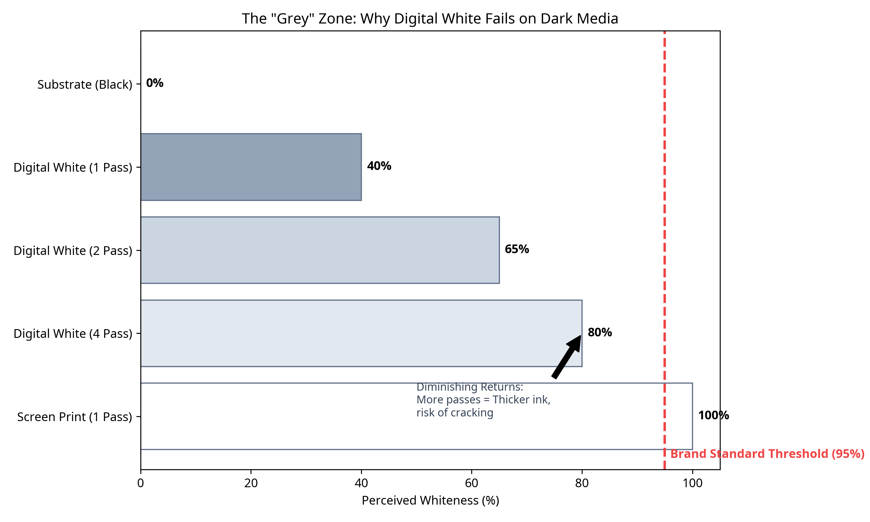
A common request from clients when they see the grey result is: "Can't you just print it twice?"
Technically, yes. We can run a "Double Pass" or even a "Quad Pass" of white ink. However, this introduces new risks:
- Registration Drift: If the notebook moves even 0.1mm between passes, the logo becomes blurry.
- Texture Build-up: Multiple layers of UV ink create a thick, plastic-like ridge that feels cheap to the touch.
- Cracking: The thicker the UV ink layer, the more brittle it becomes. On a flexible notebook cover, a thick layer of cured UV ink will crack when the book is opened.
When to Use Which?
This doesn't mean Digital UV is bad. It's excellent for full-color gradients or printing on white/light surfaces. But for the specific use case of White Logo on Dark Background, the decision matrix is clear:
| Feature | Digital UV Print | Screen Print / Foil |
|---|---|---|
| Opacity on Black | 60-80% (Greyish) | 100% (True White) |
| Detail Level | High (Fine Gradients) | Medium (Solid Shapes) |
| Setup Cost | Low (No Screens) | Medium (Screen/Die Charge) |
| Durability | Medium (Surface Bond) | High (Chemical Bond) |
The Consultant's Verdict
If your brand guidelines demand "Pure White" (Hex #FFFFFF), do not let a vendor talk you into Digital UV to save £50 on setup fees. The result will be off-brand.
For dark notebooks, White Foil Stamping or Silk Screen Printing are the only professional choices. They physically block the substrate color, ensuring your logo pops with the contrast it deserves.