The most heartbreaking moment in quality control is rejecting a batch of 500 premium notebooks because the client's logo—beautiful on a screen—looks like a "melted stamp" on the cover.
This happens because designers often treat debossing as just another form of printing. It is not. Printing adds ink to a surface. Debossing reshapes the surface using heat and pressure.
In the customization process, ignoring the physics of heat transfer is the fastest way to ruin a production run. Let's look at why your 6pt text is physically impossible to deboss cleanly.
The Thermal Bleed Radius
When we deboss a logo, we heat a brass die to over 100°C and press it into the PU leather. Heat doesn't stay contained; it radiates. Just as a drop of water spreads on a paper towel, heat spreads outward from the metal die into the surrounding material.
We call this the "Thermal Bleed Radius." If your design has two lines that are 0.5mm apart, the heat radiating from both lines will meet in the middle, melting the gap between them. The result? Two distinct lines become one thick, blurry blob.
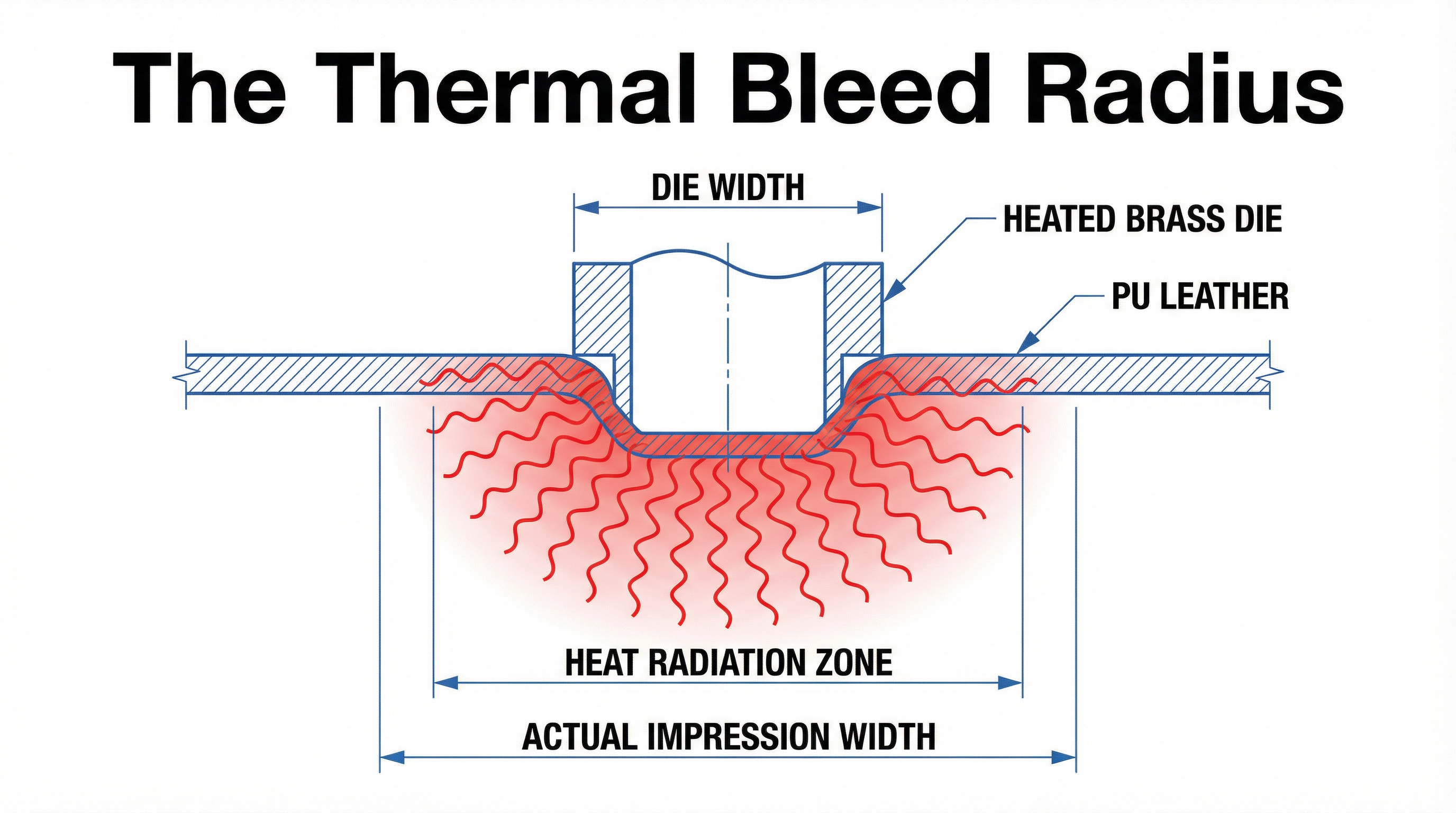
In practice, this is often where customization decisions start to be misjudged. Designers approve a PDF proof where the lines look crisp, not realizing that the physical process will inherently "bold" their font by 20%.
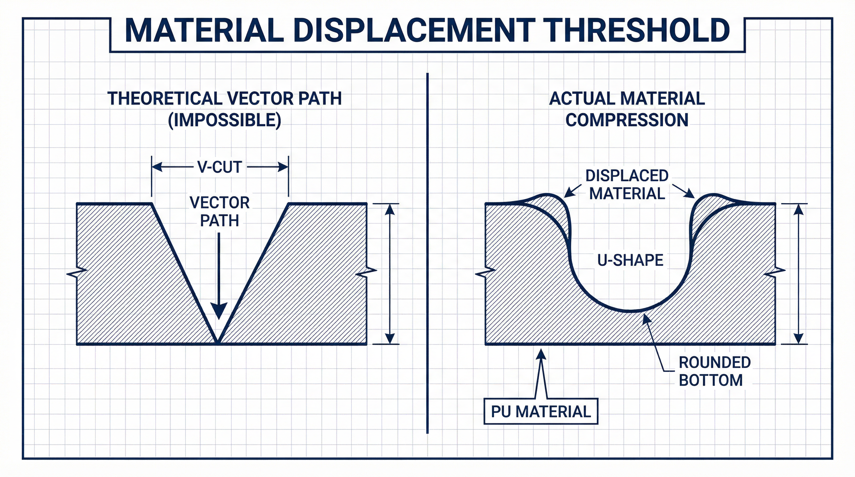
Material Displacement: Where Does the PU Go?
Debossing is a displacement process. You are pushing material down. That material has to go somewhere. It doesn't disappear; it gets pushed to the sides, creating a slight "shoulder" or bulge around the impression.
If your design is too intricate—like a crest with fine cross-hatching—there is nowhere for the displaced material to go. It gets trapped, creating a shallow, uneven impression instead of a deep, crisp one.
This is why we have strict "Minimum Line Weight" rules. We aren't trying to limit your creativity; we are obeying the laws of physics.
| Design Element | Minimum Requirement | Risk of Failure |
|---|---|---|
| Line Thickness | 1pt (0.35mm) | Lines disappear or break |
| Gap Between Lines | 2pt (0.7mm) | Gaps merge (Thermal Bleed) |
| Text Size | 8pt Sans Serif | Illegible, counters fill in |
The "Simplicity" Rule
The most premium-looking debossed logos are often the simplest. Thick lines, generous spacing, and bold shapes allow for a deep, dark burnish that catches the light. Intricate details just look like a mistake.
If your brand guidelines require a complex crest with 6pt text, debossing is the wrong technology. You should switch to UV Printing or Silk Screen, which sit on top of the material and do not suffer from displacement issues.
Conclusion
Respect the medium. PU leather is a soft, organic-feeling material. It cannot hold the resolution of a retina screen. Design for the heat, allow for the bleed, and your logo will look intentional and high-end.