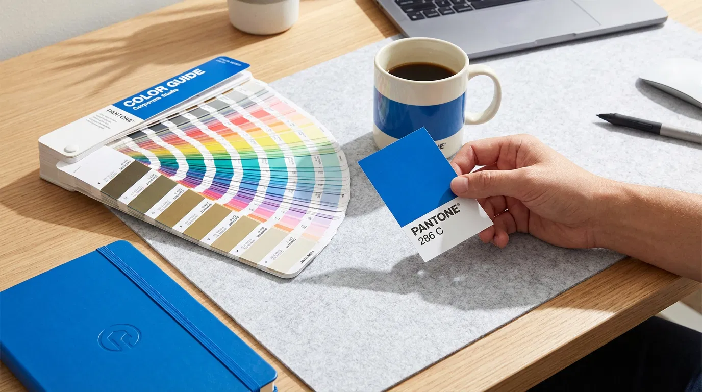
In the corporate world, colour is currency. Coca-Cola Red, Tiffany Blue, Cadbury Purple—these are not just colours; they are legally protected brand assets. When you order branded stationery, ensuring your corporate colour is reproduced accurately is paramount.
At BritStationery Works, we rely on the Pantone Matching System (PMS) to guarantee this consistency. But for many clients, the transition from screen (RGB) to print (CMYK) to product (PMS) can be confusing.
The Universal Language of Colour
Imagine asking three different people to think of "sky blue." You would get three different shades. Now imagine asking three different factories—one in London, one in Birmingham, one in Manchester—to print "sky blue" on a notebook. The result would be a disaster for brand consistency.
Pantone solves this by assigning a unique number to every shade. Pantone 286 C is the same deep blue in London as it is in New York. It removes subjectivity from the equation.
Why CMYK Isn't Enough
Most office printers use CMYK (Cyan, Magenta, Yellow, Key/Black). They mix these four inks to create a full-colour image. While great for photos, CMYK has a limited gamut. It struggles to reproduce bright, vibrant, or solid colours consistently.
Pantone inks are pre-mixed, like paint in a tin. This means the colour is solid, vibrant, and consistent. For corporate logos, which often rely on one or two strong colours, Pantone is the only way to ensure the logo on your screen-printed pen matches the logo on your business card.
Material Matters
A critical factor often overlooked is the substrate. The same Pantone ink will look different on coated paper (C) versus uncoated paper (U).
- Coated (C): Ink sits on top, looking vibrant and glossy.
- Uncoated (U): Ink absorbs into the paper, looking more matte and slightly darker.
When ordering corporate stationery, it is vital to specify the correct Pantone suffix to match the material you are printing on.
Conclusion
Brand consistency builds trust. A mismatched logo suggests a lack of attention to detail. By using the Pantone system, you ensure that every piece of merchandise you distribute reinforces your brand identity with precision and professionalism.
