The 'Lab Dip' Loop: Why "Custom Pantone" Adds 3 Weeks to Your Timeline
"Can we just match Pantone 289C? We don't need to see a sample, we trust you."
I hear this request every week. And every week, I have to say no.
It is not because I want to delay your project. It is because "Pantone 289C" is an ink formula for white paper. When you ask me to apply that same color to a textured PU leather or a woven cloth, the physics of light changes.
The 10-Day Loop
In practice, this is often where lead time decisions start to be misjudged. You assume color matching is a software setting. It is not. It is a chemical mixing process that requires physical shipping.
We call this the "Lab Dip Loop." It is an inescapable cycle of chemistry and logistics.
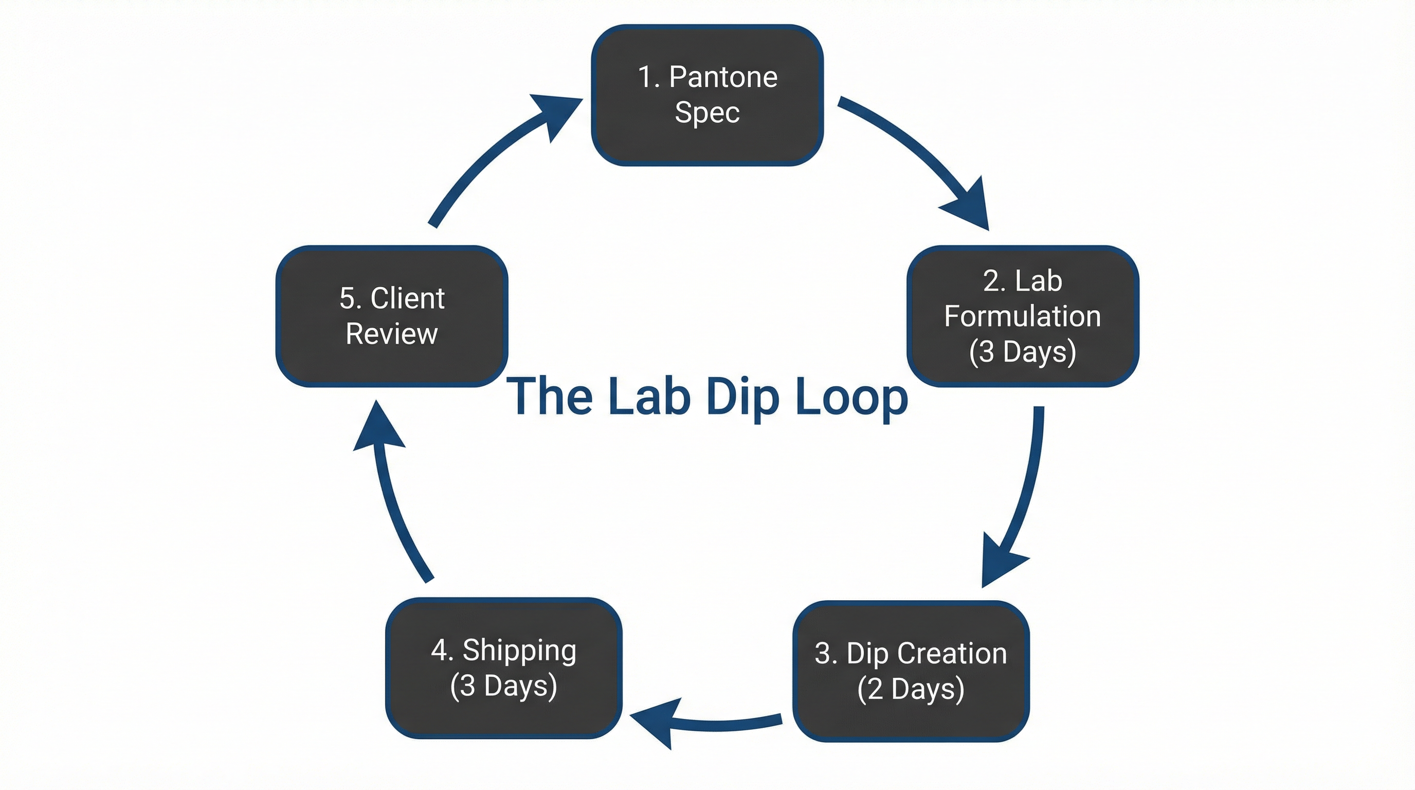
If you reject the first round (which happens 30% of the time), the loop resets. That is another 10 days. Two rounds of color correction equals 20 days—nearly a full month gone before a single notebook is made.
The Texture Effect
Why do lab dips fail? Usually, it is not because the factory mixed the wrong ink. It is because the client is looking at a computer screen, and I am looking at a piece of leather.
Texture eats light. A rough surface creates micro-shadows that make any color appear darker. A glossy surface reflects light, making colors appear lighter and more saturated.

If we simply "match the Pantone" by the numbers, your navy blue leather notebook will look black. To get the visual match you want, we actually have to mix a lighter shade of ink to compensate for the shadow of the grain.
Manager's Advice
If you have a strict deadline (under 6 weeks), do not ask for a custom Pantone match on cover materials.
The "Speed vs. Brand" Trade-off
- ✓ Fast Option:Pick from Stock Swatches. We have 50+ standard colors of leather and cloth. They are pre-approved and ready to cut. Lead time impact: 0 days.
- ⚠ Slow Option:Custom Pantone Match. We dye the material specifically for you. Requires Lab Dip Loop. Lead time impact: +25 days.